Creating a line and bar chart
Use a line and bar chart to easily distinguish between line value and bar values. This is a quick way to visually compare data sets that have different value ranges, like project cost in the millions and project hours in the thousands, or number of sales in the tens and profitability in the thousands.
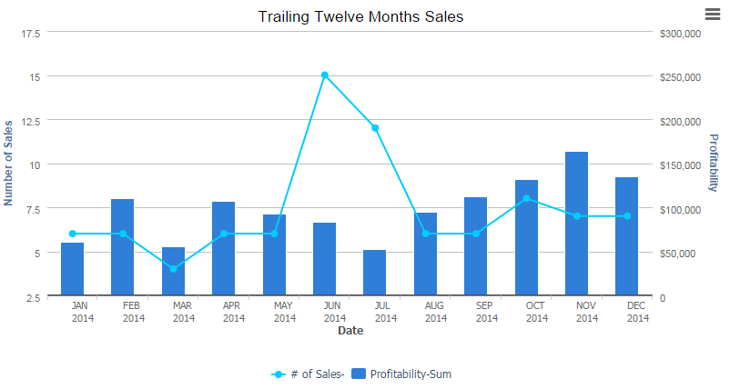
This line and bar chart provides a quick view of profitability across an organization.
Like all Quickbase charts, line and bar charts are interactive; click an area of the chart to view the record(s) associated with it. You can also apply dynamic filters to line and bar charts.
To print your chart or save it as an image, click the menu in the top right of the chart:
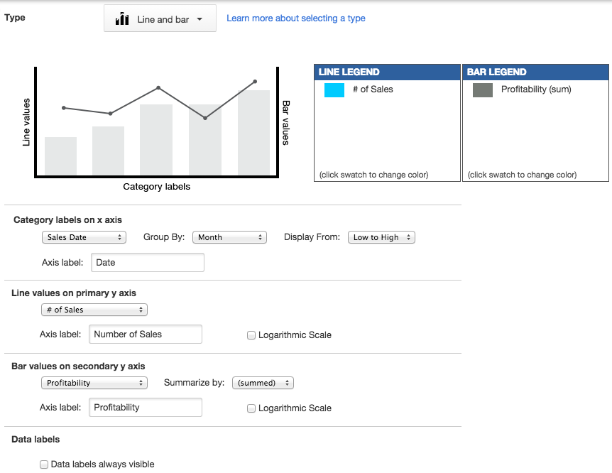
To create a line and bar chart:
-
Open the table in the table bar, click REPORTS & CHARTS and then click + New.
-
Select Chart and click Create.
-
In the Basics section, Name your chart and give it a Description.
Tip: Select Show description on chart page so others can easily understand the purpose of your chart. -
Select Line and bar as the chart Type.
-
Decide what this line and bar chart will show:
-
Category labels on x axis: select the field you want to display on the x axis.
In the Group by list, select to group values in intervals or set amounts, for example, by Month. -
Line values on primary y axis: select the field you want to display as a line on the primary y axis. If you want to define a calculated column to display in the chart, select Calculated column, and then define the calculated formula in the Options section.
-
Bar values on secondary y axis: select the field you want to display as a bar on the secondary y axis. If you want to define a calculated column to display in the chart, select Calculated column, and then define the calculated formula in the Options section.
Tip: Remember to label the axes; this helps others understand your chart.
-
Sorting: decide how to sort your line and bar chart.
-
Data labels: check if you want to display data labels. You can choose to display the value or the value as the percent of the series.
-
-
If you selected to measure a Calculated column, select define a calculated column, label it, define the formula, and select the type.
-
Filter to display only certain types of data or data that meets conditions you set.
-
Save the chart as Personal (only you can view it) or Common (others can view it). Optionally, you can also assign the report to a group.
Example
This line and bar chart provides a quick view of profitability across an organization. You can see quickly see where profitability has dipped, so you can dig in and address the problem.
This chart is defined as follows:
- Sales Date grouped by month, displayed from low to high on the x axis
- Number of Sales, summed, displays as a line on the primary y axis
- Profitability, summed, displays as a bar on the secondary y axis